A hoodie can do a lot more than keep you warm. It can show off a brand, express something about your personality, or even start a conversation. When people think about hoodie fashion, they usually think of color or style. But the placement of a logo or patch is what really makes it stand out. That small decision can turn a plain hoodie into something unforgettable. Think about how many times you’ve spotted a logo on someone’s chest or sleeve before even noticing their face. That’s the power of placement. And for Jacket Elite, hoodies aren’t just clothing; they’re moving billboards that people actually want to wear.
A Brief Look at Hoodie Styles
Before diving into placement, let’s talk about the hoodie itself. After all, not every canvas is the same.
- Pullover hoodies are the go-to classic, giving a smooth front that’s perfect for centered designs.
- Zip-ups split that space down the middle, so logos have to shift slightly to the left or right.
- Oversized hoodies, which are popular in streetwear culture, provide a lot of space for strong graphics. Cropped hoodies, on the other hand, need smaller, more delicate accents.
- Sports hoodies lean on functionality and often keep logos on sleeves or upper chests where they’re visible during movement.
- Fashion hoodies, on the other hand, can get experimental. Ever noticed how some high-end brands put tiny logos in unusual spots? That’s a style move, and it works when the base hoodie itself has personality.
And let’s not forget about trends like sp5der hoodies, which became popular partly because of their unique graphics and logo placement that breaks away from the expected. It proves placement is just as important as the design itself.
Front Logo and Patch Placement
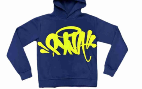
- Middle Chest Placement
Probably the most iconic spot. A big centered chest logo makes a statement the second someone looks your way. Sports teams love this for obvious reasons, and streetwear brands often go big here too.
- Left Chest Placement
This one feels professional and timeless. Think of uniforms, college gear, or even company apparel. A small logo over the heart almost feels symbolic—like wearing your identity close.
- Right Chest Placement
Less common but equally stylish, right chest logos balance out a design, especially when paired with sleeve patches. Some designers use this placement to create symmetry when the left side is too “expected.”
Back Logo and Patch Placement
Upper Back Placement
Right below the neckline, this placement is clean and subtle. You’ll see it often on gym hoodies or team gear where the brand or name should be visible without screaming for attention.
Center Back Placement
This is where bold graphics live. Large prints, brand logos, or slogans belong here. When someone walks past, it becomes a walking advertisement.
Lower Back Placement
Not for everyone, but definitely creative. Streetwear labels sometimes push patches lower for a rebellious edge. It stands out because most people don’t expect it.
Sleeve Logo and Patch Placement
- Outer Sleeve Placement
A trend that refuses to fade. Logos running down the sleeve feel sporty, bold, and youthful. Brands that want to reach younger people love them because they can be seen from the side.
- Inner Sleeve Placement
Hidden and almost private, inner sleeve logos are a designer’s secret weapon. They’re less about being seen and more about being discovered, which makes them feel exclusive.
- Cuff Placement
Small embroidery on the wrist or cuff is a stylish detail. It’s understated, but people notice it when adjusting sleeves or shaking hands. Sometimes, subtlety speaks louder.
Hood Logo and Patch Placement
- Center Hood Placement
A logo sitting right on the crown of the hood is rare, but when it’s done right, it’s unforgettable. High-fashion labels sometimes take this route because it feels bold and unique.
- Side Hood Placement
Perfect for initials, numbers, or small patches. The side placement makes a hoodie look playful and modern, and it’s especially visible when the hood is up.
- Back of Hood Placement
This one shines when the hood is down. A logo right at the back acts like a finishing touch, making sure branding is seen from every angle.
Pocket Logo and Patch Placement
- Center Pocket Placement
On kangaroo pocket hoodies, the front pocket becomes a natural placement zone. Small icons or stitched patches here look casual and easygoing.
- Side Pocket Placement
A little off-center, this adds a fun twist to an otherwise plain hoodie. It’s often used in limited collections where creativity leads the way.
- Above Pocket Placement
Simple, clean, and useful. A logo stitched above the pocket doesn’t interfere with function, yet it keeps branding visible.
Unique and Experimental Placements
- Hemline Placement
Ever spotted a small embroidered tag near the bottom hem? It’s subtle, but it works almost like a designer’s signature.
- Shoulder Placement
Shoulder patches give off a varsity or military vibe. It’s nostalgic and trendy at the same time, especially in retro-inspired fashion.
- All-Over Patchwork
For those who want to go bold, all-over patches transform a hoodie into art. It’s not for minimalists, but for collectors and fashion fans, it’s a dream.
Printing and Embroidery Techniques
Once the placement is sorted, the method matters. Screen printing is the best way to make graphics that are bright, vibrant, and stand out. Heat transfer is a good way to make little runs or detailed images, but they may not last long. Embroidery, meanwhile, screams quality. It adds texture, depth, and a sense of permanence.
Each method has its place. A giant logo across the back? Screen print it. A tiny logo on the cuff? Embroider it. Want versatility for short-term promotional hoodies? Heat transfer might be your best bet. Choosing the right technique ensures the placement you worked so hard to pick doesn’t fall flat after the first wash.
Choosing the Right Placement for Your Brand
This is where style meets strategy. If the hoodie is for a company giveaway, the left chest or upper back might be a good place for it. Sleeves and center chest placements keep the energy up for sports teams. Streetwear thrives on breaking the rules; pockets, cuffs, or hemline spots can set a brand apart.
The point is, placement should match the hoodie’s purpose. It’s not about copying trends but about finding what feels right for the audience wearing it.
Common Mistakes in Hoodie Logo Placement
Some mistakes happen too often. Logos that are too large for the chosen spot can make the hoodie look awkward. Colors that mix in with the fabric are difficult to see. Too many logos make the design look messy. Ignoring durability, like putting heat-transfer prints where pockets stretch, can cause them to peel or fade.
Conclusion
A hoodie can be just a piece of cloth, or it can be something that people remember. When done with care, placement makes it more than just clothes. Every choice, from a small logo on the cuff to a big graphic on the back, means something different. When style, purpose, and personality all come together, that’s when the real magic happens. That’s when a hoodie stops being just a piece of clothing and becomes a part of who someone is.